In trying to choose flooring, I slowly realized that most of my ideas around it were crap. I was spending hours with 3d modeling software playing with all sorts of different patterns and materials and ended up with piles of ugly messes. Floors tie everything together in a space and if they are all a-jumble, the space is going to feel the same way. And if the floors are mediocre, then that's going to be reflected in the space as well. Even with the modeling software, trying to conceptualize how the floors would feel and especially how they would feel against each other was about on par with trying to visualize what a wall is going to look like based on a 1" x 2" paint chit.
In the end, I divided the floor into three areas: bathroom, bedroom and main area (which includes the kitchen, dining area and living space). I hoped that by sticking to a theme of traditional textures, wood and concrete, I could maintain some sort of cohesion between each room while still giving each room its own particular vibe.
Bathroom
I used to think that tiles were still those cold, slippery squares in solid unappealing colours usually surrounded by dirty grout. Was I ever wrong. First time I ever paid attention in a tile store I saw this, Urban Wood by Fioranese, and have to admit that maybe a small part of the reason I wanted to have a house built was so I could use this somewhere.
The tile inside the shower is unpolished for better traction. The tile in the rest of the bathroom is polished.
Bedroom
For the bedroom, I stuck with the default engineered wood option specified in the build contract but chose to have planks in two different shades laid down in a wide stripe pattern instead of the usual solid single colour. The stripes are sombre in colour yet still add a sense of play to the room.
Unfortunately, much of this floor got covered when I moved in the king sized bed. Oh well.
Main Area
Originally, for the main area, I was going to go with vinyl floors because they don't look half bad these days, they're durable and I thought they were cheap.
I was wrong about the cheap part. At least with my builder, the additional labour and flooring supply costs to ensure a proper base for the vinyl glue adherence was going to incur several thousands of dollars in upgrades.
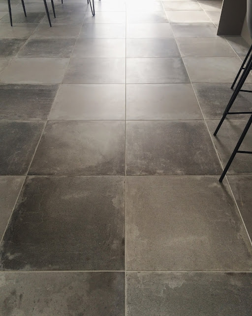
I was really dithering about what to do with the flooring in this, the largest area of the house, when I came upon this ceramic tile, the Innova by Savoia in ferro. My thinking way back before the layout was even completed was I wanted poured concrete for all the floors but due to various factors, eventually decided against it. However, this tile came close. In fact, I like the variations between each large square even more than I like a solid, single pour concrete surface.
Yeah, the tile cost even more in upgrades than the vinyl would have cost but, hey, at least it's ceramic.


No comments:
Post a Comment